

When you’re writing a book, the visuals can often be just as important as the words. After all, that’s what keeps readers engaging and looking for more. A book’s cover, illustrations, and page layout can all have an impact on how readers experience your story.
So, it’s best to invest your time in the design aspect of your book and make it more appealing to both readers and publishers. But how can you ensure that your book looks as good as possible? Here are eight tips to help you design your book’s layout and make it appealing.
1. Use a Clean and Simple Layout
A simple and clean layout can go a long way in making your book look great. You don’t have to add extra characters and spaces to make it shine. Rather, it’s advised to avoid using too many fonts and paragraph styling as it can distract readers.
Stick to one or two fonts that are easy to read, and limit the number of font sizes and styles you use. Additionally, try to use a consistent font size throughout the book. Pick one font size and style for headings and topics and another for the main body of the book, and you are more than good to go.
Additionally, use grids or columns to organize your text and images in a way that is pleasing to the eye.
2. Invest in Book Cover Design
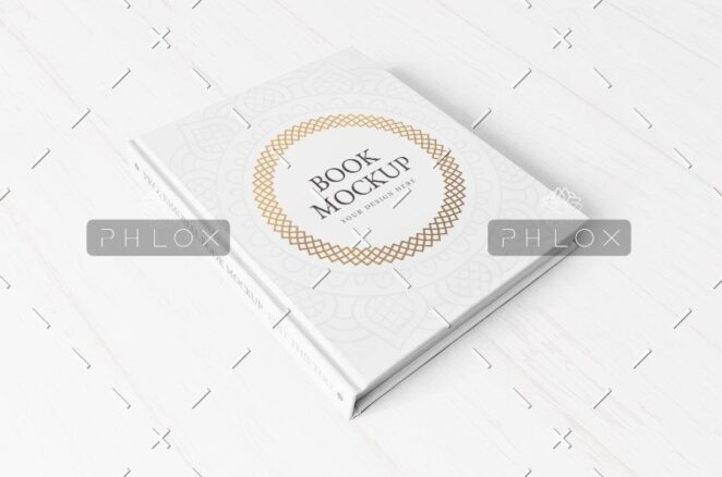
We have said it multiple times and just stated it again. The cover of your book is one of the most important things that can make or break your first impression. So, make sure it is eye-catching, unique, and reflective of the content inside.
You can either design the book cover by yourself if you know the basics of designing and illustrating. Some things you need to consider include using high-resolution images that look professional and related to the content inside. Also, write an appealing title and make it distinct by choosing the appropriate font style and size.
However, a more reliable way is to hire a professional designer to get a book cover design that stands out from the already available books in your genre. They will be able to add details you would never have thought of to give your book a more polished look.
3. Choose Imagery Carefully
Images can be a helpful tool whether you’re writing fiction or nonfiction. But if you choose the wrong images, you will destroy the true essence of your story. Don’t just pick images for the sake of having them. Consider how the image will contribute to the reader’s understanding and experience of the book.
Also, consider copyright when using images. You don’t want to end up in a legal situation because of a careless mistake. Make sure you have the right to use any image that you select. If you don’t, look for royalty-free or public-domain images instead.
Moreover, make sure the images are of a suitable size; too large or too small will not be visually appealing. If you are unsure how to use images in your book, you can take help from professional typesetters. They can be a valuable asset when it comes to designing the overall layout of your book.
4. Stick to a Limited Color Palette
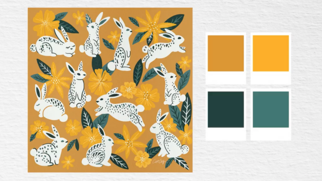
Using too many colors can be distracting and make the book look cluttered and unprofessional. Instead, choose a few colors that will help draw the reader’s eye and create a cohesive look. Think about the overall theme of your book, then decide which colors would best express that theme.
It could be one primary color and several shades of it or two complementary colors. If you must add additional colors, make sure they work with the overall theme and are used sparingly.
5. Incorporate Whitespace Wisely
Many people overlook whitespace when they are designing their book, but it can actually be a very powerful tool. Just as words are important to describe emotions, whitespace is important to keep your readers engaged so they don’t feel overwhelmed with all the words.
It also makes your book easier to read and cram. According to a study, it was found that people who read text written within margins found it easier to read and remember what they were reading.
6. Use off-white Paper for Your Book
When you pick out a notebook, one of the first things you notice is the color of the paper. The white paper is the standard, but sometimes you notice that it’s too hard on the eyes. Off-white paper, on the other hand, provides a softer look and makes your book pages look less stark.
However, due to the changing trends in the industry on white paper, it can be difficult to find classic off-white paper. But you can talk to your publisher and insist on getting your book printed on off-white or cream paper. It will not only be helpful for people with dyslexia but also help you create a theme for your book.
7. Number Your Pages and Chapters
Including running heads and page numbers in your book will not only make your book more organized, but it will also make it more visually appealing to readers. Running heads are a great way to keep track of where you are in the book.
They are also useful for readers who want to quickly reference specific parts of the book. Page numbers, on the other hand, are also essential for readers who want to quickly find their place in the book. Including both running heads and page numbers will make your book more user-friendly and increase its appeal.
8. Don’t Leave Orphans and Widows
Orphans are single words in a text that appear at the end of a paragraph, while a widow is a single line or a couple of words that appear at the top of a paragraph. These things make your text difficult to read and cannot engage readers.
If you are having some orphans and widows in your text, it’s best to remove them by changing the text alignment for that particular line or paragraph.